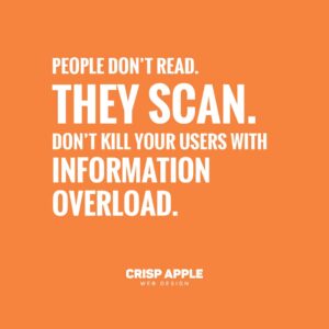
People Don’t Read. They Scan.

[intro size=24]Sad but true, people don’t read. So don’t kill your users with information overload.[/intro]
Avoid copy overload and format your content in order of hierarchy and pleasant flow of content information.
Users rely on keywords, headings, lists, and images to help them scan.⠀
⠀
Make it easy for skim readers!⠀
⠀
• Header – choose the information you want to emphasise
• Intro – briefly, outline your main benefit/offer or guarantee, etc⠀
• Subhead – description/benefit/feature/offer/deadline or guarantee etc
• Body – expand on each subhead, list features, explain each benefit⠀
• Highlight – add an attention-grabbing statement relating to your information
• CTA – call to action: encourage your reader to move to the next stage
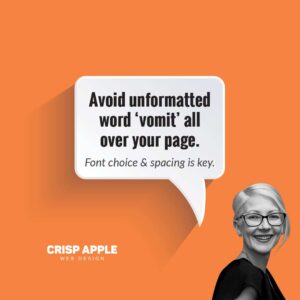
Avoid unformatted word ‘vomit’ all over your page.
Font choice and spacing is key.
Please like and share this post, the information may be valuable for someone you know or if you are delving into website development of your own. ⠀
Got any questions?
Take a bite and book in a time to speak to the Crisp Apple team ????????????????????????


Posted in Design & Development
